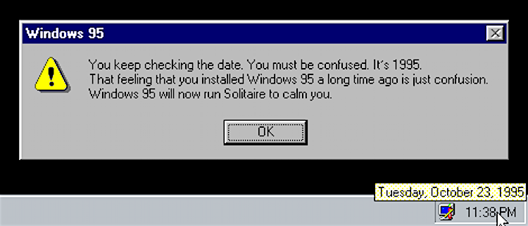
Image retrieved from the Windows 95 Tips, Tricks, and Tweaks Tumblr (parody site): http://windows95tips.com/page/3
User Interface sounds are a breed of their own. Some clearly represent their actions, such as the epochal ‘door opening’ to indicate a contact has logged on or the equally attention-grabbing announcement that “you’ve got mail,” which rationalized why you had to tie up the phone line another five minutes. Other sounds attempt to bind emotions to their actions; the wistful start up themes for Windows 95 and Mac OS assured you this is the future in their grounded, yet contemplative, chords. Whether literal or metaphorical, UI sounds are calls-to-action, sometimes to a Pavlovian degree, where this causes you to glance at your charging cable and this makes you think you’ve bumped your thumb drive. But when it comes to professional audio branding, how are these concepts used to evoke ideas such as ‘clean’ and ‘trustworthy’?
In her article for The Verge, Adi Robertson takes a look and listen at Skype’s audible UI and its current re-branding with Design Principal Steve ‘Buzz’ Pearce and Listen‘s Steve Milton. She walks us through the history of UI sounds, sharing stories about those who gave personality to otherwise silent actions, from William Gaver’s sound design for Apple in the 1980s to Jim McKee’s textured themes and Brian Eno’s 6 seconds of perfection in the mid-90s. Along the way, she uncovers some of the approaches these pioneers took in marrying audio to GUI and emotion to information, all with the intent to “make the world sound better.”