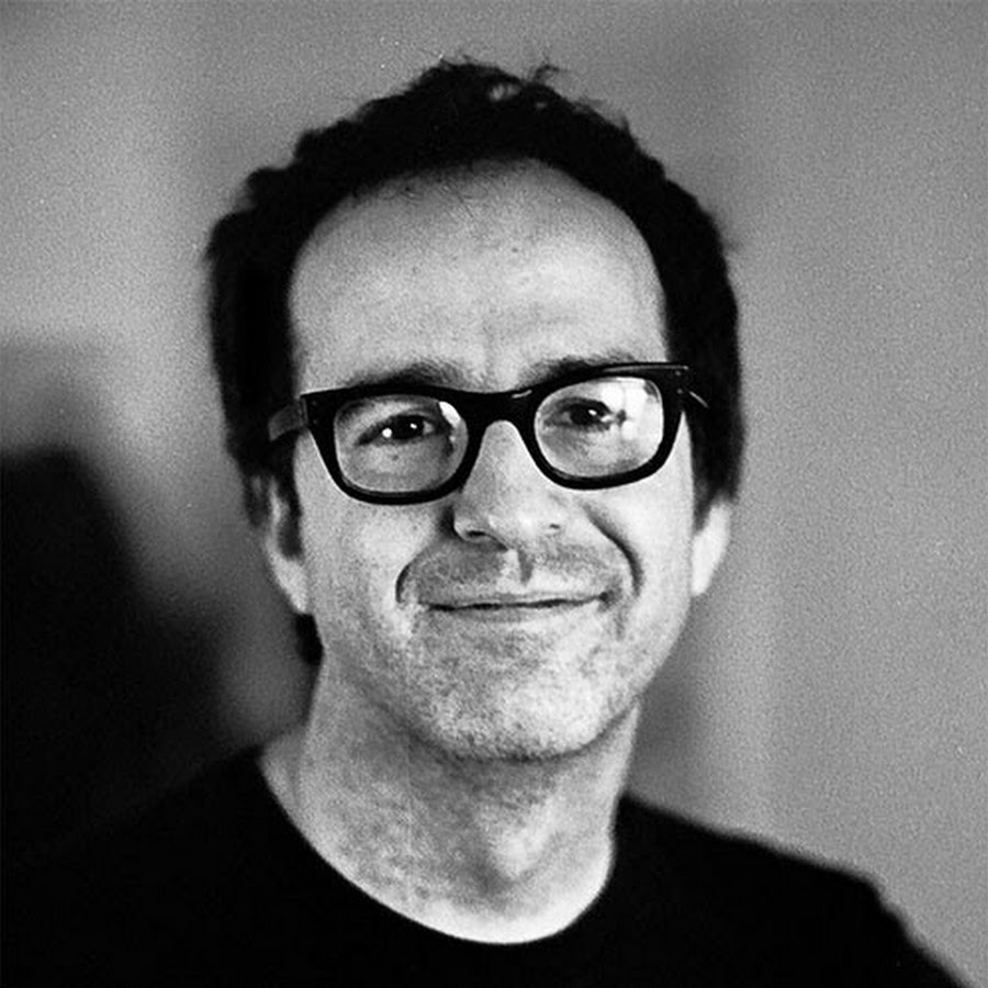
This is a guest post by Randy Jones, founder of Madrona Labs a Seattle-based company making hardware and software for computer music. You can reach him @MadronaLabs.
Human-centered design is so mainstream now that it is synonymous with good design. This is as true in the making of sound creation and processing tools as in any technology. The concepts of usability, requirements and human-centered evaluation are central to current practice in making hardware and software tools. It is taught in trade schools and universities alike, and enshrined in an ISO standard [1]. But good design is hard, even with a good methodology, and there is a real inertia to the metaphors that underlie our creations. In this article I’ll point to some ideas from human-centered design and in particular, writings about humane interface, that still offer plenty of untapped potential to lead to better tools.
Donald A. Norman first coined the term “user-centered design” in the late ‘80s, and offered a very relatable and persuasive argument for the approach in his book The Design of Everyday Things. [2] Who can’t relate to trying to use a thing, getting frustrated, and then blaming not the designer of the thing, but themselves? Norman helped readers think more critically about the designer’s role by presenting a great collection of real-world examples of things gone wrong and systematizing aspects of design to address them.
Design of synthesizers and audio tools presents some unique conceptual challenges. Most tools are meant to perform a function we can define easily and produce an outcome we can perceive easily: a light switch turns the light on and off, and we can see if the room is bright or dark afterwards. Norman breaks down a tool-using action into seven stages, from forming the goal, to forming the intention to take action, to interpreting the state of the world and evaluating the outcome. These stages make sense for well-defined actions. But what if the action is to compose a melody? How do we evaluate the outcome? Paying attention to some principles of humane interface design can improve our understanding of audio tools in all sorts of uses, from simple quantifiable tasks to richer interactions that may seem more ineffable.
First, do no harm
As audio workers, we interact with our tools intensely, sometimes for many successive hours, whether deeply immersed in a compositional process, sweating out a deadline, or both. This level of intensity makes ergonomics an important concern. In making my own music, I’ve clicked and dragged enough blocks around timelines building compositions in various environments to know I want to avoid that way of working whenever possible—the repeated click-and-hold operation required is a particularly effective trigger of my tendonitis.
Jef Raskin, in his book The Humane Interface [3], demonstrates different ways to quantify the efficiency of a user interface including the the GOMS keystroke model and the well-known Fitts’ law. I consider attention to physical concerns such as these the first principle of humane design: don’t hurt the user or, through indifference, allow them to come to harm. Raskin’s own computer design, the Canon Cat, was not mouse-based even though he was well acquainted with the option, having worked at Xerox PARC. Instead of a mouse the Cat used two Leap keys for navigation. Holding the left or right Leap key while typing a sequence of characters would instantly move the cursor to the previous or next instance of those characters. Combinations of the Leap keys with other keys allowed navigation by words, sentences, paragraphs and pages. Positioned just under the space bar, the Leap keys beautifully leveraged the grasping ability of the human hand to add ergonomic control.
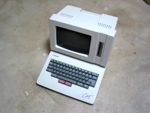
In addition to the Leap keys, the Cat had a “Use front” key that could be held along with many of the alphabetical keys to activate a variety of commands. This kind of mechanism is useful for audio work, as we can see from the successful line of musical instruments from Elektron that use an equivalent “Shift Mode” function very consistently.
The Canon Cat was way ahead of its time in several aspects. While the mouse and the whole desktop metaphor UI are excellent for naive users, there are better and more ergonomic options for experts in various application areas. Raskin was a crucial advocate for shifting the conversation around computer design from a technological to a more humane perspective. A charmingly dated and yet convincing demo of the Cat in operation is available on YouTube.[4]
Design from the knobs in
Another aspect of a humane outlook towards interface is prioritizing the user’s experience above the technological means needed to produce it. This poses some interesting questions particularly in the realm of synthesis, because what differentiates a synthesizer from others is often that very technological means. From subtractive instruments with fat, overdriven filters to FM synths with complex operator routings and no filters at all, the sound-making algorithm or circuits often seem to be what a particular synthesizer is about and the main determiner of its musical possibilities. How could they not be?
And yet, we have this quote from Don Buchla, one of the most influential synth designers ever, and obviously a big proponent of “knobs first”:
“An instrument that’s well designed won’t become obsolete. But the tendency is for engineers to design musical instruments, and needless to say, being engineers, they design from the inside out. They design the circuits, and then they put knobs on them. But if a designer expects to design legitimate instruments, he has to design them from the outside in. He has to build the outside of the instrument first. This is what the musician is going to encounter. You cannot become obsolete if you design a legitimate instrument from the outside in. I don’t care how you make the sound. If today it’s analog and tomorrow it’s digital, fine.” [5]
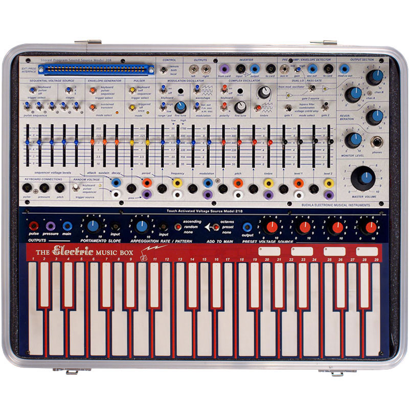
In my own work in synth design, I still find that the underlying algorithms are the heart of an instrument, but I’m moving further and further in the direction of the “engineering” controls being hidden away by musically useful abstractions. After the engine is done, a lot more work is needed to bring out the musicality of an instrument by tuning response curves and sometimes combining multiple underlying parameters into a single control. This mimics the complex interactions and “leaks” that go on inside acoustic instruments and give some analog circuits their unique musical feels.
Design for the body
Humans are so good at making subtle and expressive gestures that we don’t expect computer interfaces to keep up with us. But given the digital sensing and processing capabilities available in recent years, the extent to which they don’t is mainly just due to inertia.
The MIDI standard was released in 1983. Despite efforts to expand or replace it, MIDI is to this date the only widely accepted digital communication format for use with musical instruments. By far the most common use of MIDI is to transmit “velocity-only” performances in which only the initial attack speed of a note is captured from a musical keyboard. There are a lot of reasons why this has been considered good enough by so many musicians—and no list would be definitive—but as a start I would point to the dominance of the piano in Western musical culture, and the continual novelty in timbral possibilities that new synthesis methods provide.
More recently though, persistent effort on the part of a few designers has produced instruments with much more expressive potential, and the MIDI standard has moved to accommodate it.
In 1999, Lippold Haken, a professor of Electrical and Computer Engineering at the University of Illinois, released his Continuum Fingerboard as a commercial product. In development since 1983, the Continuum Fingerboard was the result of a long effort in which many different sensing technologies were explored to make a more expressive performance controller. The Continuum Fingerboard sends a continuous stream of x, y and pressure values for the entire duration of each note, enabling an intimate contact with sound. In combination with the Kyma sound design system, whose makers Symbolic Sound have worked closely with Haken, or with Haken Audio’s own EaganMatrix modular software released more recently, the Continuum Fingerboard is a deeply expressive instrument.

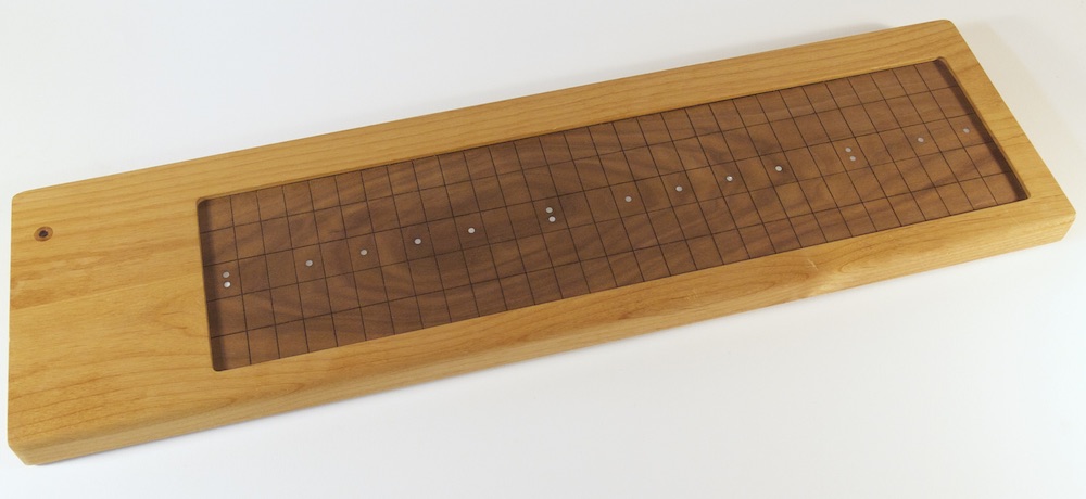
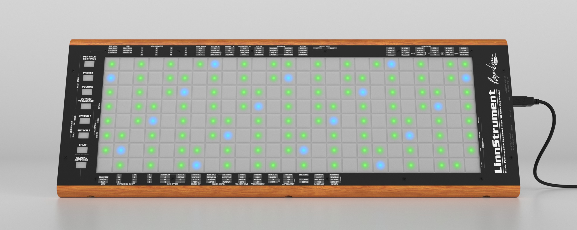
A number of other instruments—or as some say, controllers—have since followed that support simultaneous, expressive gestures. Eigenlabs’ Eigenharp, the Madrona Labs Soundplane, Roger Linn’s Linnstrument, and the Seaboard by ROLI are all innovative designs released more recently. Recognizing this groundswell of interest in more expressive musical interfaces, in 2018 the MIDI Manufacturers Association adopted an enhancement to the MIDI specification [6] to allow multiple streams of control data for each note in a performance.
Just enabling a firehose of performance data is no guarantee that the result will be musically useful. The data has to arrive in a timely fashion, with minimal variation in the time between collection of data points (jitter). Wessel and Wright [7] place “an acceptable upper bound on the computer’s audible reaction to gesture at 10 milliseconds” and for jitter, give an upper bound of one millisecond.
An instrument should also faithfully transmit pressures over a range that covers all of the expressive gestures performers can make. Like our perception of audio volume, our response to touch is effective over a very wide range. How best to connect the two sensory modes is an interesting and very deep question. Precise sensing technologies and careful attention to human factors are needed to develop instruments that let us play, as Roger Linn puts it, “In that special place between silence and whispers.” [8]
Design good limitation
Cognitive load is a term from psychology that refers to the amount of mental effort being used to keep information in working memory. Minimizing the cognitive load required by an interface is an important goal for usability.
A pitfall that maturing software applications tend to run into is an accretion of features that makes the interface more and more complex. This unwieldiness manifests in different ways: in a toolbar-based application like Photoshop, as a proliferation of icons and submenus; in a modular, object-based application like Max/MSP, as a bigger and bigger selection of objects that can go into a patch. In each case, though the maintainers of these applications have taken thoughtful steps to reduce the apparent complexity, the cognitive load added by the number of choices is real.
We tend to view limitations of tools as deficits, but they are also potential strengths. A tool with a small set of controls offers the user the possibility to learn it like an instrument, where common motions go into muscle memory. This increases productivity and enjoyment by enabling a state of flow.
Extensibility of intentionally simple tools is possible through expert modes that can reveal additional controls. Another way to offer extensions is by creating hooks to a scripting language such as Python or Lua. Not everyone wants to write computer programs, but extending an already useful tool with ideas of one’s own can be a fun and useful way to start.
Design the weird and wonderful
I hope by now I’ve made the case that there is a huge wealth of human-factors writing and research out there, foundational ideas and real live data that designers need to understand. And yet, there’s an important side to of toolmaking that doesn’t fit into a scientific framework. Synthesis is a creative pursuit, even if it’s done in some goal-oriented context like making a commercial. So, there’s room and indeed, a need, for tools that fly in the face of everything sensible we can say about interface design.
One example is the beloved Roland TB-303 Bass Line. With its stateful programming interface, multiple modes and and minimal visual feedback it requires a high cognitive load of the player/programmer. Though its analog controls are pleasant to tweak, its interface as a whole doesn’t offer evidence of human-centered design. Its genius lies in its control mappings. The ability to push its minimal circuitry into the organic squelch for which it’s famous, and the very particular and inspired musical contours of that squelch, are not features that could have ever fallen out of any rational design process starting from the brief “make a programmable bass accompanist.”
To make inspiring tools that might lead us down new side roads or, in the right hands, birth entire new genres of music, we have to let mystery and the poetic gesture into the process. And given the longstanding acceptance of the “studio as instrument,” [9] I believe there’s room for more weird and wonderful tools in traditionally utilitarian areas like processing and mixing as well.
Demand better designs
Jef Raskin’s vision for the Canon Cat was that it would be a true consumer appliance for information processing. In many respects he succeeded, though the machine was not a commercial success. We are still waiting for a Cat for synthesis and composition: an “audio appliance” with enough generality to make it a useful studio in a box, but specific enough to avoid the many distractions that our computers and phones create.
Whether you design new instruments or audio tools or simply spend a lot of time using them, the industry needs your feedback to lead it in a humane direction. I hope that the ideas and anecdotes above give you some fuel for that.
____________________________
References
[1] ISO 9241-210:2010. Ergonomics of human-system interaction — Part 210: Human-centred design for interactive systems. https://www.iso.org/standard/52075.html
[2] Donald A Norman, The Design of Everyday Things. Doubleday, 1990.
[3] Jef Raskin. The Humane Interface: New Directions for Designing Interactive Systems. Reading, MA: Addison-Wesley, 2000.
[4] Leap Technology (video) https://www.youtube.com/watch?v=o_TlE_U_X3c
[5] Jim Aikin, The Horizons of Instrument Design: A Conversation with Don Buchla, Keyboard Magazine, Aug 30, 2016 https://www.keyboardmag.com/artists/the-horizons-of-instrument-design-a-conversation-with-don-buchla
[6] https://www.midi.org/articles/midi-polyphonic-expression-mpe
[7] David Wessel and Matthew Wright, Problems and Prospects for Intimate Musical Control of Computers. Proceedings of the CHI’01 Workshop on New Interfaces for Musical Expression (NIME-01), Seattle, 2001.
[8] http://www.edmpublicist.com/hammarcia-com-daily-dj-interview-roger-linn/
[9] Brian Eno, The Studio As Compositional Tool. http://music.hyperreal.org/artists/brian_eno/interviews/downbeat79.htm
